Best Practices for UX/UI in Healthcare Website Design
The digital experience of healthcare is beginning to be a larger factor in developing patient relationships. In fact, in 2020, 50% of healthcare consumers surveyed agree that a bad digital experience with a healthcare provider ruins the entire experience with that provider relationship.
In order to create a satisfactory healthcare website experience that keeps patients engaged, you must focus on UX/UI design. Whether you are redesigning your healthcare website, or auditing to make sure you’re following website best practices, here are a few tips on understanding how to maximize UX/UI design to increase patient engagement and conversions on your healthcare website.
What is UX/UI?
UX:
User Experience (UX) focuses on the effectiveness of components on your website. Each element on your website should have a purpose and create a cohesive user experience. UX isn’t about the visual design elements, but more so about the structural component of your website and how the user is designed to interact with your website.
UX designers will first begin by designing a website wireframe that doesn’t include aesthetic elements such as fonts, colors, and animations. Instead, the UX design will show where specific components will be and how they will be used by sketching out the user flow on the website for each page and element.
The UI designers will then take the wireframe and add the business’s branding and other design elements to further the website experience.
UI:
User Interface (UI) design focuses on the look and feel of a digital product. This is where you start to focus on visual and responsive elements of design such as icons, images, buttons, fonts, color, etc. UI design is focused on making sure the product is intuitive, and visually guides users through the product’s interface. Not only does UI make your website visually appealing and reflective of your business’s branding and tone, but it also keeps users engaged, maximizes the usability of your website, and therefore increases chances of conversion.
Why UX and UI together matter
UX and UI are much different and often get confused. However, both are equally important in creating a great healthcare website design that resonates with your patients and their perception of your healthcare practice.
To keep it simple:
UX is the overall experience.
UI is how interfaces look and function.
UX creates the structure for your site, and UI brings it to life. They go hand in hand to create a clear and effective website.
Need some help tackling UX/UI on your healthcare website? Contact Pyxl to chat with our web design and development experts about creating a website that caters to you and your patients’ needs.
Why is UX/UI important on your healthcare website?
Patient-focused
By prioritizing UX/UI on your healthcare website design, you are putting the patient’s experience first. Catering to their needs and structuring your website to be a resource for them and not a place to gloat is essential. Not only does it look aesthetically pleasing, but it creates a personalized experience for your patients in a digital space.
Builds trust
A patient’s trust is the foundation of establishing an effective relationship. Since 45% of patients search online for health information before visiting their doctors, it is important to provide a user-friendly website. The UX/UI design you determine should be intuitive and functional, so patients will not feel confused or bombarded. This builds trust between you and your patients, as it shows your team wants to share information with them, not keep them in the dark.
Accessibility
Using efficient UX/UI design creates an accessible experience for all. Having a clear and simple healthcare website design not only makes the digital experience visually appealing, but functional for all users with any ability, screen size, or internet speed. This is putting the patient’s needs first, no matter where or who they are.
ADA compliant
ADA guidelines are a top priority in your healthcare website. All patients have a right to experience your website in a manner that best suits their needs. Make sure all UI aspects like color, tone, and buttons are easy to read and responsive to ensure your website is accessible for any patients with disabilities.
How to develop a strong UX/UI focused site
Research your audience
What are they looking for? What questions do your patients need answering? Keep these types of questions in mind when designing the UX/UI for your healthcare website, as your patient’s needs should be your number one priority and focus for all website design decisions.
Focus on what’s most important for your patients and create your website flow from there. Remember, UX/UI is about the user experience. By understanding your audience and what their core values are, you can assess what elements should go where, and what colors, branding, and visual elements they respond to best.
Don’t do anything wild! Keep your healthcare website design simple and cohesive to ensure your users are able to quickly and easily find what they’re looking for on your site
Best practices for UX/UI features and functionality:
Clear layout
Incorporate a clear layout with labeling on your healthcare website to make it easier for patients to find information. Your website should have a natural flow of information.
Simple and intuitive
Don’t reinvent the wheel. Keep it easy and intuitive to help users to find what they’re looking for. So while some trends might seem “cool” and visually appealing, you still need to think about your patient’s usability and what makes the most sense for them to achieve the goal on your site.
Be efficient
Elements need to be effective, efficient, and satisfactory to meet the standards of UI.
User centric
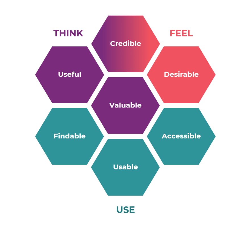
Your design should follow all elements of the user experience honeycomb:

Keep information concise
Most users only stay on websites for around 10 seconds, so it’s important to keep the important information and CTAs above the fold, and use short paragraphs and bullet points to keep information concise and help users quickly find the information they need.
Keep your design consistent
Maintain consistent tone, branding, and imagery throughout the entire website.
Information architecture is important!
Keep all healthcare information legible and easy to navigate for ease of use on your site. The goal is for patients to accomplish any tasks and understand your brand the first time they visit your website. Don’t create a difficult environment for patients to find information. It is best practice to answer any questions with 1 click on websites.
Test and test again
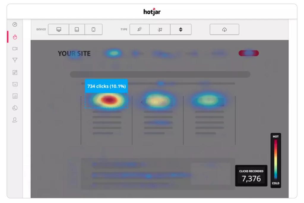
Follow through with A/B testing to make sure different aspects of your site are appealing to what your patients want and need, not just based on what you assume they are looking for. You can use different tools to run different tests on web pages to see actionable results of what’s performing best.
HotJar is a software that can be used to show exactly what end users are doing on your website. No more making assumptions. With heatmaps and actual recordings of where patients are hovering and clicking, you can see what elements work and what elements need improvement for the most efficient healthcare website design.

GoogleOptimize allows your team to test web pages and compare performance so you can make educated and research-based changes to your site as needed. This tool can also integrate with Google Analytics for more behavioral insights.
Examples of good UI/ UX on Healthcare websites
CancerSupportCommunity
On CancerSupportCommunity, there is a dedicated section for answering frequently asked questions. The colors, hierarchy of questions, and quick but thorough answers all create a good UX/UI experience for their patients. By keeping elements organized and easy to identify with consistent branding, their website answers questions that their patients have without a deep dive.

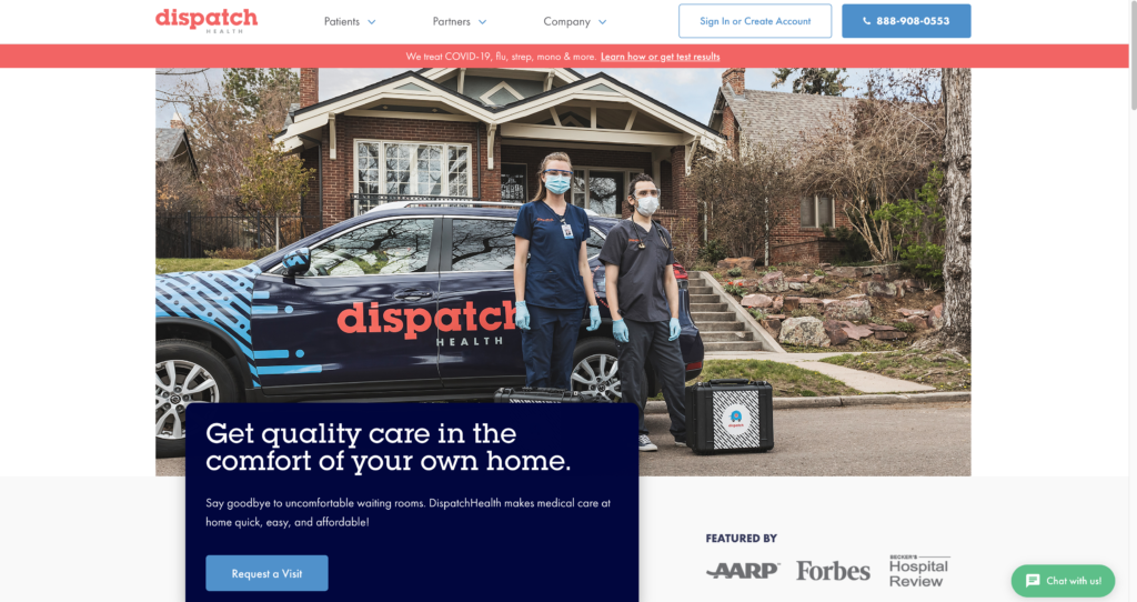
DispatchHealth
DispatchHealth’s website uses clear color contrast and comfortable white space allowing the user’s eyes to scan quickly for information. The bright red banner and blue button call attention to the important elements and therefore answer top questions their patients may have (How to call DispatchHealth and COVID-19 Test Results) in a concise manner.

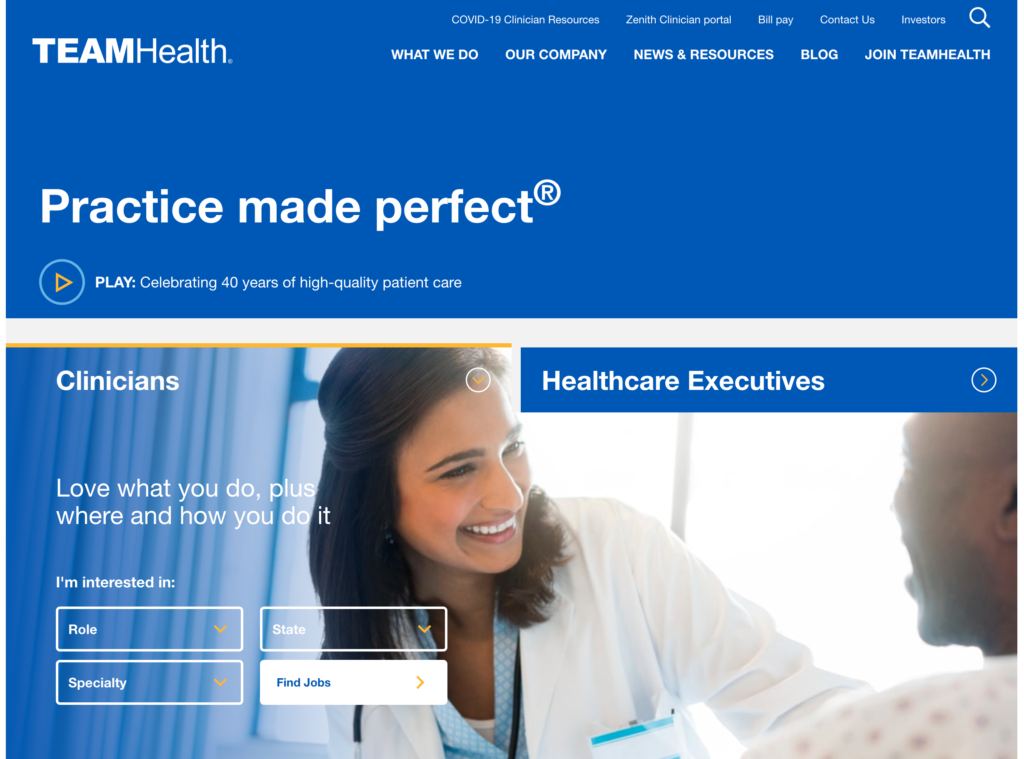
TEAMHealth
Check out how Pyxl’s team helped TEAMHealth with their healthcare website design. This section on their website creates a streamlined UX/UI experience through built-out structure, high color contrast, and answering questions without information overload. The website UX/UI showcases high-value information in an easy-to-access position while remaining visually appealing, which is a key factor to a good user experience.

Partner with Pyxl
When it comes to your healthcare website, your patients are the top priority and therefore all structure and design elements should be dedicated to providing a great patient experience. It is important to put their needs first and incorporate UX/UI best practices on your healthcare site to create a clear and visually appealing experience that helps your patients achieve their goals while on your site.
If you’re interested in evaluating your healthcare website’s UX/UI, contact Pyxl! Check out some healthcare websites our team has designed to get an idea of what Pyxl can do for your website:
Our web development team works with you to create a comprehensive website experience for your patients.
Updated: May 13, 2025
 Kati Terzinski
 Erin Murray