The Case for a Mobile-Responsive Website in Healthcare
 Bonnie Winter
Bonnie Winter
Bonnie Winter
Right now, you may be reading this from your mobile device. It’s true that over 60% of searches online now come from a mobile device. The need for mobile-responsive websites continues to grow and drive new patients to Healthcare companies. Does your Healthcare company currently have a mobile-responsive website? If not, you may be already behind your competitors.
What is a Mobile-Responsive Website Design?
A mobile-responsive website means that your site is able to dynamically change based on what screen size it’s being viewed on. A website that’s easy to read and use on a desktop should also be scaled and optimized to fit on a tablet or mobile device. This includes readable text without requiring zoom, adequate space for tap targets, no horizontal scrolling, and automatically scaling content and elements to match the screen size. Mobile-responsive website design prevents visitors on mobile devices from needing to do extra work to read your content or use your website.

Why a Mobile-Responsive Website Design is Vital to the Healthcare Industry
The Mobile Market is Growing
55% of American adults own smartphones, and 42% own tablets. As of October 2020, 48.62% of all web traffic comes from mobile devices, in comparison to 3.81% back in 2010. Mobile usage continues to rise year over year, making mobile marketing one of the key digital marketing strategies adopted by organizations to promote their products and services.
Increase the Number of Patients and Referrals
It is crucial to provide a responsive experience because 52% of consumers are increasingly using their smartphones, tablets, and media devices to find Healthcare providers, read hospital reviews, and access Healthcare information.
Stanford University’s study showed that 75% of people make an initial judgment on a business’ reputation based on their website design. And according to a study done by Matthew Casey, the decision to stay on a webpage can be made in as little as 50 milliseconds, mainly due to the page’s visual appeal. These statistics represent the importance of creating a website experience that mimics the quality of care you provide and if you don’t have a responsive website design, you could be losing potential patients by the second.
Increase Credibility as a Reliable Healthcare Provider
The purpose of creating an online presence is to expand (and prove) your credibility and reputation as a healthcare provider. When your website is not responsive, it shows a poor representation of your company. 61% of users said that if they didn’t find what they were looking for right away on a mobile site, they’d quickly move on to another site. When potential patients leave your website because of poor website accessibility, your company loses credibility as a trustworthy healthcare facility and misses out on opportunities for revenue and patient referrals.
A prospective patient’s perception of your credibility can impact the success of your practice. For an optimal patient experience, your services, contact information, and calls-to-action must be clear and easy to read and use on all devices.
Increase Search Visibility
When a user visits your mobile website and stays on your website, that in turn reduces your website’s bounce rate. Google rewards websites with good (low) bounce rates by increasing visibility on search engines. In short, a website with a good mobile user experience will show up higher in search results above one without, regardless of the content on the site. This means more potential patient reach when someone searches for “Nashville Healthcare provider” or “hospitals in my area,” for example.
The majority of people who use Google Search and other search engines do so from a mobile device. According to their blog post, Google will use your website’s mobile version to index and rank your site to help users easily find what they are looking for. When you do not maximize SEO features such as adding a mobile responsive website Google will rank you lower. Given that the first page of search results garner 92% of all traffic from the average search, you’re missing out on a huge portion of your potential patients if you’re not on that first page. Without a responsive site, your Healthcare institution will fall far behind your competitors.

The Rise of Healthcare Mobile Apps
By 2022 annual mobile app downloads are projected to reach 258 billion. That’s a 45 percent increase from 178 billion downloads in 2017. The mobile health market alone is expected to continue to grow in the coming years and is predicted to exceed 300 billion U.S. dollars by 2025.
Heather Mack of MobiHealthNews reported that in one survey of smartphone users, 58% of them used “their phone to communicate with a medical professional,” and nearly 50% of respondents “have a fitness, health or medication-tracking app.” More than 318,000 mobile healthcare apps are available for patients, and around 200 new apps are being built each day, according to Liquid-State. Because of the increase in mobile app usage, more and more healthcare providers are turning to mobile apps to improve the communication and user experience with their patients.
Healthcare apps are made to help patients access health information quickly and conveniently versus pulling up a website. This means if healthcare companies want to provide value to their patients their mobile apps need to be responsive too. Some good examples of mobile apps in Healthcare are Teladoc, Generis, and EyeCare Live.
Benefits of Mobile-Responsive Website Design
Cost-Effectiveness
Creating a mobile-responsive website takes away the need to maintain a separate mobile site because it’s still the same website that shows on desktop mode, only the content, images, etc. are being dynamically scaled to automatically fit on each device. Mobile development initially takes away costs such as maintenance costs, special configuration costs, or other costs related to running two different versions. Especially as a Healthcare organization, the need to decrease overall spending allows for growth in other areas such as content creation or expanding the market funnel.
Improved User Experience
Just like walking into a Healthcare facility, the need to show a good presence is important. Your patients should feel as if they are receiving the same service online as in person. Your healthcare website should allow your users to quickly and easily find important information about your practice such as services, contact information, and location.
On top of that, Google is revamping its page experience ranking system to prioritize websites with user experience such as load time, interactivity, and the stability of content as it loads. So if you want your website to reach a high volume of potential patients, a mobile-responsive website that provides a good user experience is more important than ever.
Higher Conversions
A consistent experience can increase lead generation, sales, and conversions. Lowering your bounce rate allows the conversion of new patients. When a user decides to subscribe to your service, they want to have a consistent experience across your website. If your users enjoy a professional and positive interaction with your site, they are 67 percent more likely to convert. By providing an optimal and seamless user experience, your users are less likely to turn to a competitor and the chances of increasing conversions are substantially higher.
Mobile-Responsive Best practices and Examples
White Space Design
The use of white space design helps guide the users’ eyes along with the page. You can organize your content to guide the user through an experience. Overall, white space not only provides a professional look and feel but improves the readability and scalability of your website by 20%.
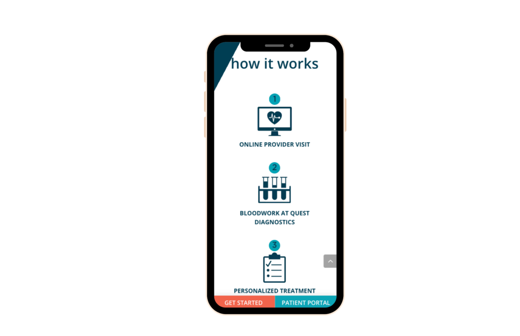
Navigation
When arriving on a website, your patients are looking to easily find information about the topic they searched for. Navigation is about creating a layout that minimizes the number of clicks it takes for people to find things on your website. This feature allows your users to quickly achieve their goals and have a good experience on the site.
The navigation on mobile devices should fit the screen, and “stick” at the top of the page so it’s always available no matter how far the user scrolls down the page. The navigation bar should not be intrusive to the screen, and users should not have to click two or more places to find what they are searching for.
Interested in more tips on how to improve your healthcare website? Check out our blog on the “8 Components Your Healthcare Website Needs.
Adaptive Design
Creating an adaptive design is a best practice because it allows the user to have a consistent experience, whether on their laptop, tablet, or mobile device. 75% of website credibility comes from the design. So when you are creating your website, make sure to invest time and money the first time.
Short and Quick Paragraph Content
Content that is easy to read and quickly understood will allow your patients to be more “responsive” to your website and your content. Bullet points, short paragraphs, and informative icons can help your readers promptly digest information in a specific order.
A website that’s mobile-responsive might also display different content based on what device they are on. Scaling your content down to hit value points on mobile devices will ensure your content isn’t too overwhelming for mobile users as they scroll. This will also make them more likely to stay on the site for longer as their engagement will increase.
Text and Element Sizes
The text and element size should also complement the device it is on. If text is too small and difficult to read, or if elements like a link or CTA are too small for fingers to touch then it will make it difficult for users to click and your users will end up not clicking at all.

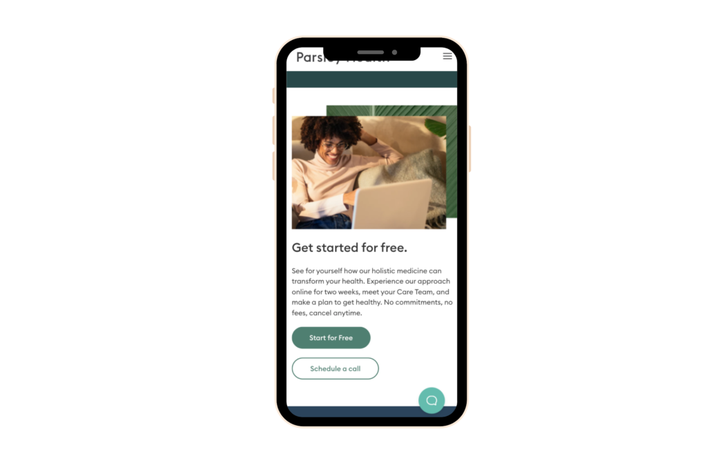
Keep Content Above the Fold
All high-value content should appear above the fold of your website page. The mobile device experience tends to be longer, because mobile is trying to fit all of your content into a smaller width screen. The average website user will typically spend less than 15 seconds on your website. This means you should aim to have your high-value content, including your CTA, contact information, and services toward the top.

Looking for more Healthcare website best practices? Reach out to Pyxl to discuss how we can take your website to the next level. Our UX designers will perform an audit of your current website and provide examples for improvements.
Partner with Pyxl
Healthcare organizations, independent practices, and hospitals can be hesitant to redesign their websites to be responsive as it can be costly and time-consuming. Yet, broadcasting your medical practice online with an outdated website design may be hindering your growth.
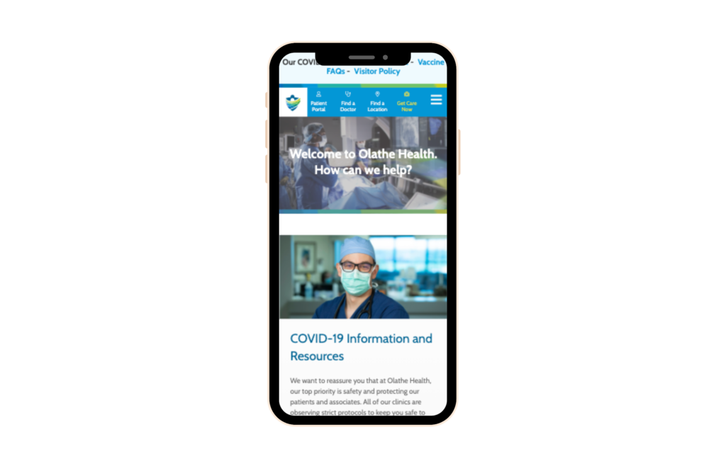
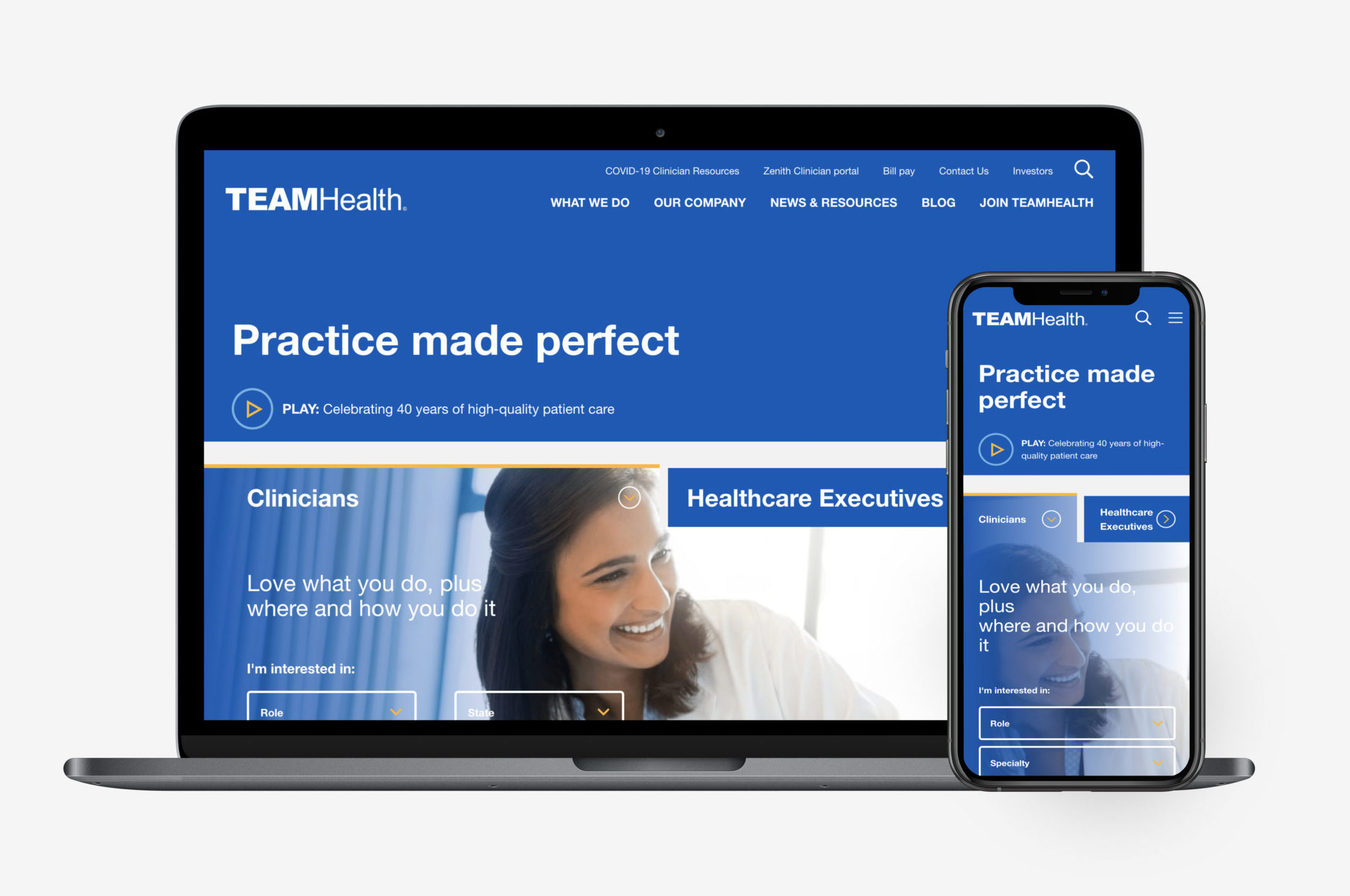
If your website is currently not mobile-responsive, make sure to reach out to Pyxl to help! We have UX designers that have helped a handful of Healthcare companies, like egnitehealth.com and teamhealth.com, improve the design and functionality of their websites to enhance their patients’ experience with their brand. Connect with Pyxl for help designing your mobile-responsive website today!.

Updated: Apr 13, 2022
 Kati Terzinski
 Erin Murray