5 Examples of Impressive Healthcare Website Design
 Bonnie Winter
Bonnie Winter
Bonnie WinterIf you’ve ever gone from an achy joint to death’s door in 30 seconds thanks to WebMD, you know that health research and patient education starts online. Whether it’s your own health, a new doctor, or a particular hospital’s reviews, digital presence is a huge player in modern healthcare. And while the healthcare industry has been slower than others to embrace the digital era, many organizations have adopted cutting-edge website design, making their digitally plugged-in patients rejoice.
As a part of medical practice —whether you’re a hospital, medical practice, insurance group, pharmaceutical company or specialist’s office—one of your main goals should be to reach, attract and convert your potential patients, while engaging your current patients. A stellar web experience that goes above and beyond meeting basic needs can help you reach that goal.
But what exactly does that mean? There are many important aspects of healthcare website design, but we’ll highlight four – let’s take a look.
Your website needs to be responsive
A responsive website is mobile-friendly and built to seamlessly scale to whatever device someone might be using. A responsive website on mobile browsers is especially important, since over 80% of people in the US own and browse on smartphones, and over 55% own and browse on a tablet. These numbers aren’t stopping here either—mobile usage will continue rising as smartphones and wearable tech adoption keep spreading.
It needs to have an engaging design
Responsiveness is really just table stakes for a website. On top of that, your medical website design needs to appeal to today’s consumer. Using modern, polished stock image resources is a primary (and easy!) way to keep your website youthful and captivating. And whether it’s with images or design, your site should tell your company story while giving people an accessible, engaging user experience.
The navigation should be easy to understand
Your website’s visitors shouldn’t have to dig through information to find what they’re looking for. Your site’s navigation, especially home page and calls-to-action (CTAs) should be logical and appeal to your visitors. For example, if you’re a medical practice, “Location,” “Meet Our Doctors” and “Insurance Information” should be front and center, in addition to a “Schedule an Appointment” CTA and your office’s phone number.
The content needs to be optimized for search
Your hospital and healthcare website might be responsive and tastefully designed, but if the content isn’t optimized for search engines, how will potential patients find it? By conducting research on your target audience, you can figure out what they’re searching for related to your services. For example, if you’re a hospital in Georgia that specializes in ACL reconstruction surgery and rehabilitation, ensure that your hospital’s website has content that contains related keywords, such as “Georgia ACL reconstruction surgery.” Contributing to a blog can also help with your Search Engine Optimization(SEO) efforts – of course, you’ll need to post consistently to maintain it. Consider focusing each blog post on a long-tail keyword – for example, “post ACL surgery recovery period.” By writing and publishing a blog that’s centered around that keyword and topic, you’ll attract potential patients hoping to learn more about what will happen after they receive an ACL reconstruction surgery. Attracting readers in turn allows you to educate potential patients and position your organization as trustworthy, bringing you one step closer to converting them from a visitor into a current patient.
To help you visualize these four points and get some web design inspiration, we’ve gathered 5 responsive medical web designs that provide a great user experience and highlight exceptional healthcare website design.
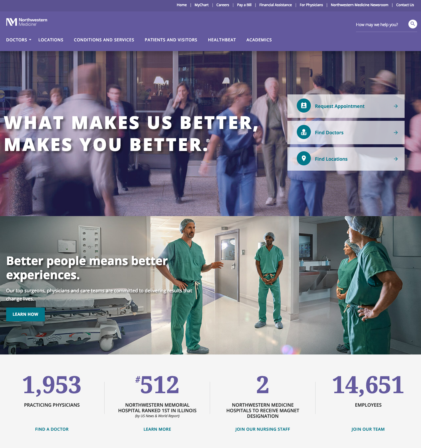
Northwestern Medicine
Northwestern Medicine features a wonderful layout that isn’t overwhelming or intimidating like many healthcare websites are. They use the menu as a place to sort the discovery traffic coming from website and social media referrals, while also using very straightforward CTAs before the page break to direct users who already know where they’re going on the website.
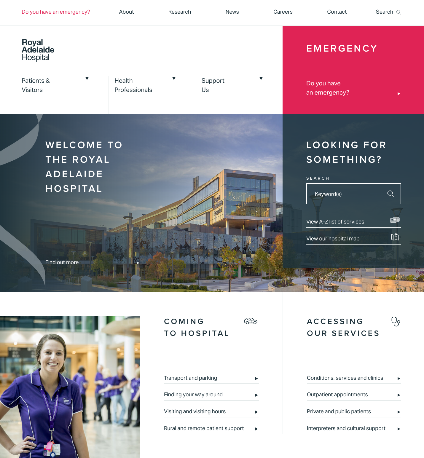
Royal Adelaide
This Australian hospital’s website makes a great first impression in terms of design and a memorable experience. A key takeaway on this website is the way that the CTAs are very cleanly organized while also remaining toward the top of the page. One of those CTAs reads in large text “Do You Have an Emergency?” Not only is this an immediate attention-grabber, but it also creates a sense of actually caring about users—which in turn encourages users to explore what other services the hospital offers. Most importantly, this site sticks to its brand feel and narrative, which is cutting-edge for the healthcare industry.
Knoxville Pediatric Associates
KPA’s website features a slider of images of smiling children, welcoming visitors to the site. The navigation includes “Meet Our Practitioners,” which leads to a page showcasing each physician’s picture, as well as their name, favorite color and favorite cartoon character. It’s a great way to make a potentially really scary situation (the health of your children) a bit more friendly and engaging.
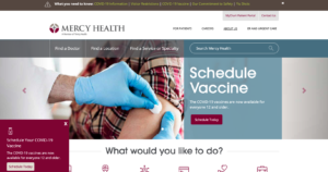
Mercy Health
On Mercy Health’s website, it’s clear they’re positioning themselves as a leader in healthcare in Cincinnati and surrounding areas. The use of large imagery and motion to engage the user is an exceptional user experience. This website captures Mercy Health’s voice and style with the home page alone, but then effectively carries it throughout the rest of the website. They also maintain a blog that has a variety of healthcare-related stories and topics to draw new users through search engines
 .
.
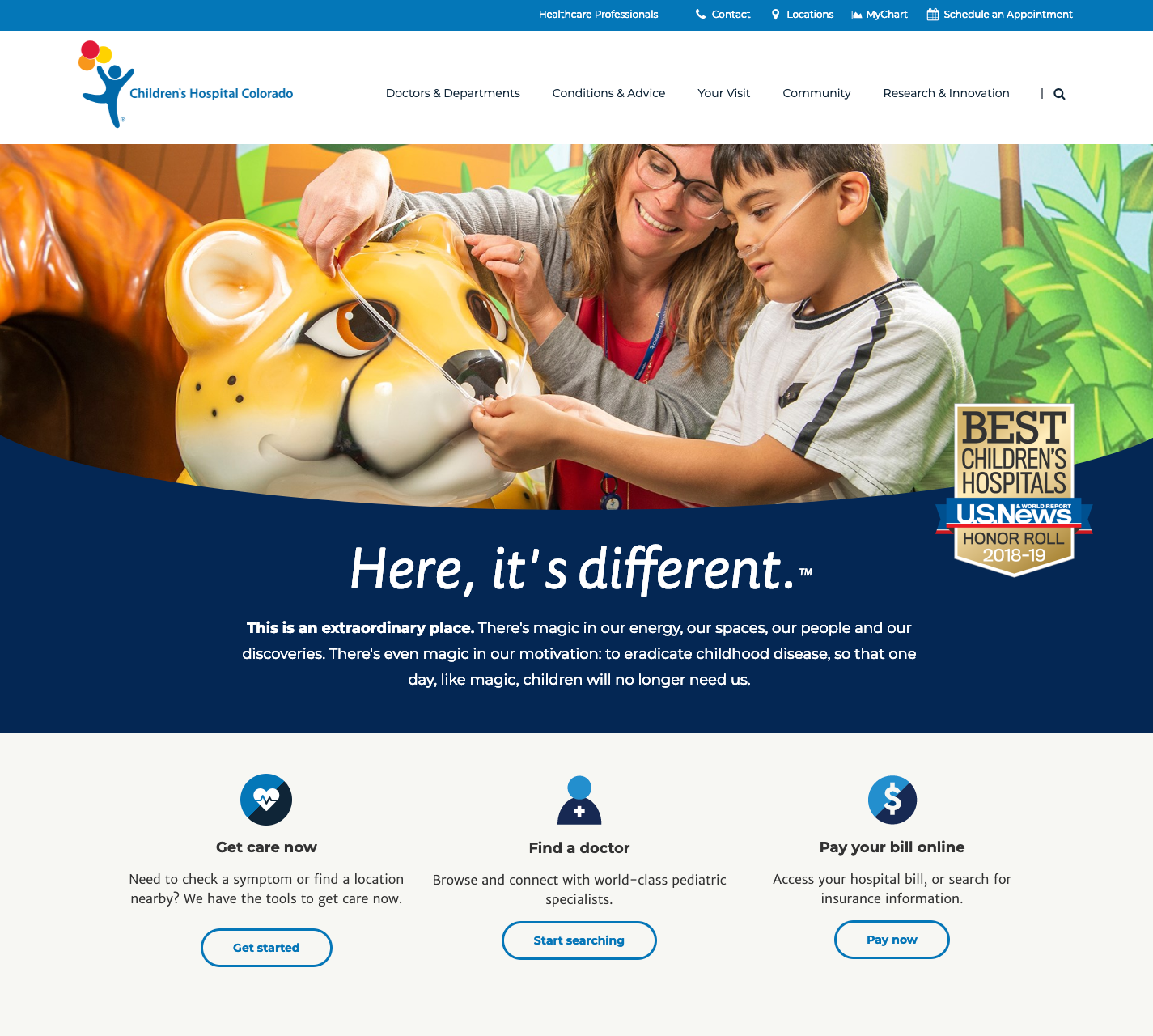
Children’s Hospital of Colorado
This website did a great job of sticking out from the crowd. They may not be the most modern and cutting edge, but they displayed information in a helpful hierarchy. They also chose to display images of real people and use real videos instead of stock photography, which is a difficult feat to manage but really engaging when done well.
So, what do you think? Do you agree with the design and UX direction of some of our favorites? Are you happy with your current website? If your healthcare organization is lacking an impressive digital experience, we’d love to talk with you! At Pyxl, we specialize in healthcare digital strategy, including creating web properties for companies in many different segments of the industry. Our ultimate goal is helping our clients convert site visitors into leads and, ultimately, customers (or patients). Take a look at some of our recent work, or contact us today!
Updated: Nov 15, 2024
 Kati Terzinski
 Erin Murray