Why It Was Time for a New Website, New Colors, New Typography, and a New Illustration Style
Today we’re unveiling a new look for Pyxl. Never one to do things in half measures, we redesigned our website from the ground up, with new brand colors, new brand typography, and a new illustration style. A new website is a huge undertaking for any brand. Read on to find out more about why we decided it was time and why we worked for months on our makeover.
Why did we undertake a brand refresh?
As a digital marketing agency, we design innovative, ground-breaking digital properties for our clients every day. The web has grown up and with it, the various tools we use to build it have evolved—newer features in CSS, like Flexbox, have provided ways to build designs that previously would’ve been next to impossible. But like the proverbial shoemaker’s son, we hadn’t updated our brand colors since we started nine years ago and we hadn’t updated our website in over four (!) years. We would never let our clients go that long between site updates, so it was time to live by our advice.
What do our new colors say about us?
When we launched the Pyxl brand nine years ago, our brand colors were perfectly in line with web colors and technology at the time. Vintage styles and grunge colors were what all the cool kid agencies were using. They were colors that held up quite well, actually. But in the last few years, digital trends have shifted towards brighter, lighter tones.

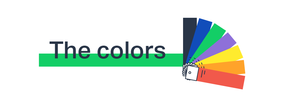
When it was time to rethink our brand colors, we wanted something that was reflective of who we are today yet also gave a nod to our history. We stuck with blue and green as our primary colors but brightened them up. We’ve also added a secondary color palette to augment our design. (Note to start-ups: if you limit yourself to two colors, your designs get old real fast.)
Why did we spend so much time looking at new typography?
Much like web technology and colors, typography can become dated, too. Our old font families were DIN, Adelle, and Proxima Nova. We picked them for utilitarian reasons—when we last redesigned our site, we wanted typefaces that would be accurately rendered on all browsers, for all users. However, the internet has evolved a lot in the past five years.
Our new typography is modern and has a bit more personality. We chose Aktiv Grotesk for our headers and calls to action. It’s bold, strong, and sturdy. Minion Pro was our choice for body copy because it reads well on a variety of screen types, which is especially important for long form content. (Plus, it’s got Minion in the name – hehe.) Finally, we chose Gibson as our supporting text typeface because it’s friendly and approachable, just like us.
Who decided we needed an illustration style?
Prior to this brand update, we didn’t have a set illustration style. Our designers had a free range so long as they stayed within the brand colors…and even that didn’t always happen. The result was a lot of great work—it was fun, it was quirky—but there was no consistency.
Justin Hudson, our Art Director, decided to establish guidelines for a Pyxl illustration style. He wanted a simplified form that any of our designers could use, regardless of skill level. As you can see from our blog headers, this illustration style plays with lines and washes of color. The end product is bright, bold, and draws from our full-color palette.

What’s next?
We’ve launched our new website and refreshed all of our essential collateral but that doesn’t mean we can sit back and bask in the celebration of a job well done. (Well, we did have a little party to celebrate, but now it’s back to business!) This is only step one. We want to make sure that our shiny new website looks great and converts leads. That means extensive testing and experimenting, constantly tweaking and improving. Plus, we have a whole wishlist of features that we had to leave out of this version due to time constraints.
Updated: Nov 15, 2024
 Bonnie Winter
 Kati Terzinski
 Erin Murray