Web Typography Best Practices
 Taylor Farace
Taylor Farace
Taylor FaraceIf you deal with web copy on a regular basis, you may wonder from time to time if you’re doing it right. Maybe you’re tasked with setting up your company newsletter or spinning up a landing page to promote a limited-time offer. Maybe you work at a marketing firm creating digital marketing materials and don’t have time to get the designer involved. (Or maybe you are a designer and just want to brush up on your web typography basics. You’re welcome here, too.) Whatever the reason you’re dealing with digital type, use this quick guide, full of web typography best practices, to make sure your online marketing copy is actually being read.
Why Does Web Typography Matter?
“What does it matter what my copy looks like? People can read, can’t they?” It’s not a question of whether they can. If you’re not setting up your typography correctly, they won’t. Whether or not your audience actually reads your copy depends on a number of factors, including:
- The personality and tone your typeface suggests
- Visual hierarchy and “scanability”
- Size and spacing
- Readability (surprisingly, this isn’t a given)
Think about it. What’s the point of your copy in the first place? To get your users to do something. The proper web typography frames your content in a way that helps them find what they’re looking for. And for you, that means more web conversions.
Take a look at these best practices, and get started implementing them. When your users achieve their goals, you achieve yours. It’s a win-win.
Picking Fonts
So, let’s get down to it. The most common question we hear when it comes to web typography is, “What font should I use?” As much as I’d love to give you the name of a typeface you can go download, that really wouldn’t help you. Instead, these questions should narrow down your choices:
1. Do you have established branding?
The answer to what typefaces to pick goes beyond preferences and trends. It goes to the core of who you are (or who your client is) as a company. The font you pick will subtly convey a certain tone, which helps form the personality of your brand. Check out how these different typefaces affect the tone:

If your branding has already established a specific typeface, try to use it. If your brand’s fonts have not been defined, start with professional branding work and a brand guide that gives direction on every aspect of your brand, including typefaces.
Whether you have established branding or not, the fonts you choose will carry a certain vibe. Determine the vibe you’re going for and pick your fonts accordingly.
2. Is the font readable?
Typography rules are a little different on the web than they are in print formats. Serif typefaces are commonly known to improve reading speed and comprehension when printed, but when displayed on screens, the serifs can run together because of a lack of proper pixel definition. This may get better as screen resolutions improve, but for now, sans-serif tends to be more popular for small text on the web.
In addition, some typefaces are just downright difficult to read quickly. You don’t have a split second to waste on making your users work to comprehend what you’re saying, so be careful when choosing heavily stylized typefaces. Read through the text in the left and right columns and take note of which ones are harder to read quickly.
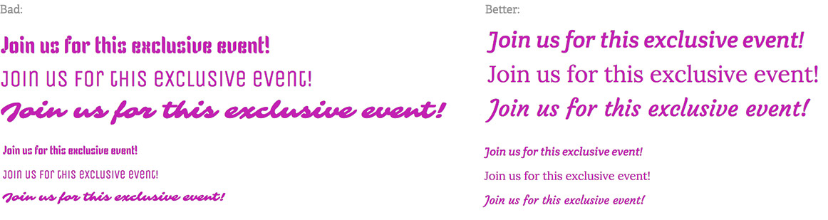
That extra delay is exactly the reason many users get tired of reading and jumping off a page. When in doubt, simple is better. If you’re hoping to communicate a very unique tone, like fun and whimsy, there are plenty of typefaces out there that can convey that feeling while remaining readable. And don’t forget about colors and graphics; you have more than typefaces at your disposal to create a mood!
3. Do you have a good contrast of fonts?
It’s important to have a distinction between headings and body – you can do this by using fonts within the same family or picking contrasting typefaces. If there’s not enough contrast, either in size, color, or thickness, it tends to look like a mistake.
Mixing fonts
Typefaces can be beautiful complements of each other but look for contrast and similarity in the right ways. In general, you want similarity in angles (is the font rounded or sharp?) and contrast in width (fat typefaces generally look better used as headings with a thinner body font beneath). The important thing is to create a consistent definition of how each typeface should be used.
Unless a wide range of typefaces is necessary for the style you’re going for, it’s best to stick with just a couple—especially if you’re not a designer (leave it to the pros.) With every new typeface you add, you’re also adding the potential for inconsistency within your brand, making it less recognizable. Make sure you have a system for how they should be used. Select a style for headings (this can be more stylized) and one for body copy (which should be more standard and readable in small sizes). Check out this example from a site we recently launched for Pacific Quest:

The fonts used for headings and body copy have a nice contrast. More stylized typefaces work better as display text on large headings while the smaller text should always be clear and readable. Though these typefaces are vastly different, notice that both are sans-serif and modern. A classical, sophisticated typeface like Garamond just wouldn’t fit in with this youthful, organic vibe.
Setting Up a Clear Hierarchy
Nobody reads pages top to bottom, word for word. Readers rely on a hierarchy of headings to scan the page and see if it’s what they’re looking for. The more structure you provide them, the easier your pages are to scan – for both humans and search engines. Search engines crawl your H tags, searching for keywords so they can present searchers with relevant pages.
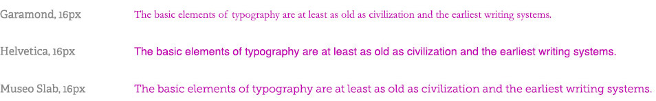
When it comes to the size of your body font, the standard has steadily increased over the years. The rise of high-resolution displays means that a 12px body copy, which was standard way back in the stone age of the Internet, now looks tiny. These days, the standard is closer to 16px, give or take a couple of pixels. Keep in mind, that the size and readability of your typeface depend heavily on the way the typeface was designed. Take a look at the difference in length in these examples, all set at 16px:
When it comes to headings, here are some things to keep in mind:
- Differentiate in size enough so that users can plainly see a difference. This is usually accomplished with H1-H3 sizes. On longer pages with more content, an H4 may be necessary. If you’ve gone to H6 or 7, chances are users aren’t going to see a clear distinction between them, and they lose their usefulness.
- On the other hand, be sure you don’t have too drastic a size difference in your headings, or else you’ll find yourself needing in-between heading sizes later down the road.
- Make your heading text contrast with your body text. It can be the same font, but bold and larger, or tall and condensed, paired with a more proportionate body.
Don’t Forget to Test
When you’re done setting up your email, landing page, or website, be sure to preview it as if you’re the target audience reading it for the first time. Quickly scan the headings—Are they easy to find? Do they give a good idea of the content? Test it on mobile devices to make sure your text is readable no matter how your audience is viewing it. (And, if your email or website is not responsive? That’s a whole other topic we need to talk about.)
Over 90 percent of information on the web is in the form of written language. Make sure yours is optimized for digital viewers! To find more inspiration on web typography, check out our portfolio.
Updated: Nov 15, 2024
 Kati Terzinski
 Erin Murray