What does website accessibility mean?
Today, technology is an essential part of everyday life. Over 4.48 billion people use the internet, which is more than 58% of the world’s population. Also, there are 1 billion people with disabilities worldwide that have challenges being able to use technology and the internet. All users should have the same ability and experience when navigating your website. There are a ton of great best practices businesses can implement to create an environment that makes devices, services, and products more accessible to people with disabilities. Designing and developing accessible healthcare websites will allow more people to not only use your website but also have a great experience while doing so.
Why is it essential to have an accessible healthcare website?
Healthcare practices cannot assure access to products, devices, and services for people with disabilities if they do not take their actual disabilities into account. Disabled individuals may have difficulty seeing a screen, have difficulty using a computer mouse, or suffer from dyslexia and difficulty reading, for example. It’s up to the business to 1. make sure their website is ADA compliant and 2. make it equally easy for everyone to use and find the answers they’re looking for.
Best practices for healthcare website accessibility
Accessibility best practices on your website can allow for a better informed and more diverse audience. As a company, you should work to cater to everyone in your target audience despite their race, religion, disability, etc. When potential patients feel that they are not receiving the whole experience, they are unlikely to continue on the website or become a loyal patient.
Assistive technology
Integrating assistive technology with your website will help people who have difficulty typing, moving a mouse, reading a screen, or using a touchscreen phone. It allows them to easily navigate your website to research your services and book appointments. A consistent experience for people with physical disabilities is impossible without this technology.
Accessible formats for content
Digital accessibility should provide an inclusive experience and therefore healthcare companies should publish content in various accessible formats for their patients. Some examples include providing text alternatives for images, offering closed captions for videos, creating audio descriptions for text files, and remediating your PDFs so they are tagged and compliant with standards.
Make sure your site is keyboard-friendly
A website must be accessible without the use of a mouse. Assistive technologies usually rely on keyboard-only navigation. Therefore, your site’s primary features must be accessible via a keyboard too.
The Tab key is the most commonly used way of navigating on a keyboard. Using this, you’ll automatically be able to jump between links, buttons, and forms on the page, depending on where your keyboard focuses. As a result, you must check that all web content and navigation can be accessed using Tab.
Choose your colors carefully
Make sure the colors you select on your site contrast well to ensure that everyone can distinguish between various elements on the page. The most pressing issue is making sure the text stands out against the background. Ideally, you should set a dark color against a light one, making sure that they don’t bleed into each other. There are plenty of online tools you can use to find and test color combinations. WebAIM has one, and we also like Contrast Checker because it gives you a score in real-time.
Enable resizable text that doesn’t break your site
Users can resize the text on most devices and browsers, which can help those who are blind or have low vision. Although not every site can resize text, your website should be responsive so the text (and other elements) can adjust in size when reading on different smaller screens like a phone.
A good approach is to avoid using absolute units such as pixels when describing text size. You can do better by using relative sizes that allow the text to scale based on the other contents and screen size. To ensure your site meets these criteria, test your font sizes thoroughly by increasing your browser’s zoom level.
Easy to find FAQs
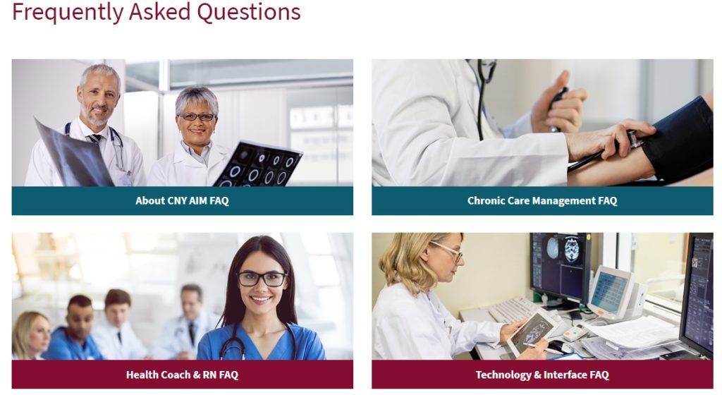
Creating clear and concise content that answers questions will allow potential customers to have their questions answered within the opportunity window. Some best practices for creating clear and concise content include writing in short, clear sentences, avoiding unnecessarily complex words, avoiding acronyms, and using list formatting when appropriate. This makes it easy for users to quickly and easily find what they’re looking for while they’re still engaged on your site. Also, provide quick and simple linked shortcuts throughout your website copy that lead people to more information on that topic.
CTA best practices
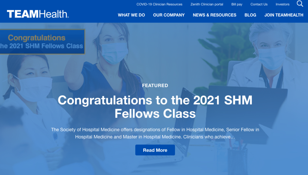
In addition to making your website accessible, creating clear CTAs (calls to action) on every page allows potential patients to navigate your site. For example, CTAs can provide users with the ability to schedule an appointment, find a doctor, get in contact with a representative, take a tour, or make a payment, to name a few.
CTAs should be designed with best practices and be accessible to everyone. These practices are essential in healthcare websites because when planned strategically and executed correctly, CTAs can help hospitals, health plans, and various healthcare and medical businesses improve campaign outcomes. CTAs are an essential tool to effectively drive traffic and impact product and service lines when appropriately deployed across multiple media channels.
Your CTA should be large enough where your mouse (or finger if you’re on your phone) can easily click it, but not too large where it obstructs or ruins the page’s layout design. Most UI dimensions provide suggestions that CTA should be 34×26 pixels. Applying contrast colors also allows the cta to stand out on the page and guide them through the website. CTAs are primarily effective when kept to a minimum with the number of words included. For example: “Contact Us” is catchy and easier to read in a box than “Speak With One of Our Representatives” Choosing appropriate words gives strong and direct instructions so users can know exactly what to do next.
Easy navigation
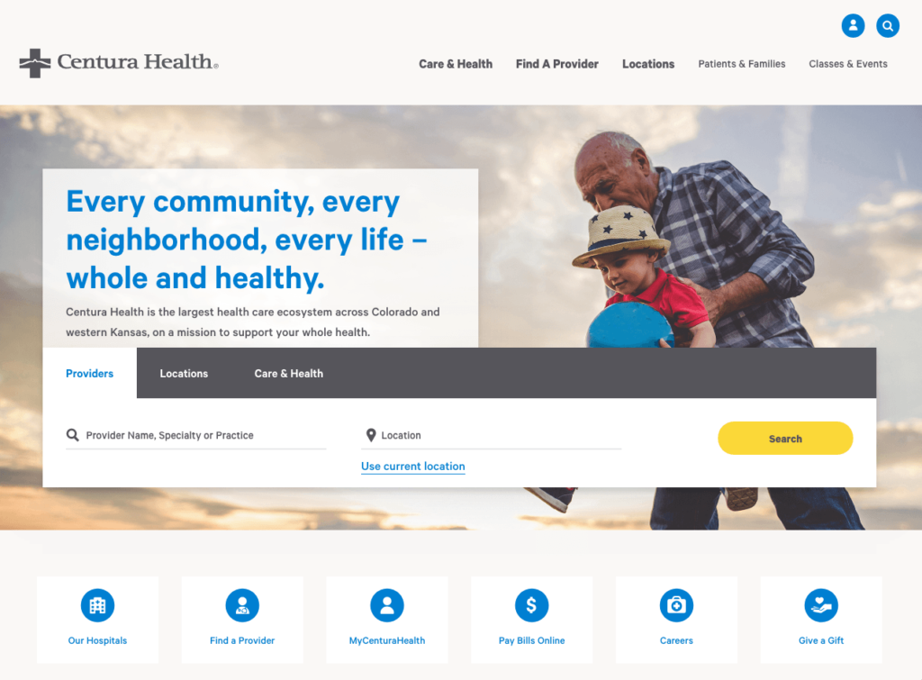
Simple, straightforward navigation combined with a prominent search function on the center of the home page enhances your website’s usability. Easy-to-use navigation should also take keyboard shortcuts in mind. Following the recommendations listed above in the best practices, keyboard functions should allow users to navigate the site using their keyboard easily.
Accessibility requires clear paths of navigation for current or new potential clients. For example, existing clients can log in to their patient portal or request a prescription refill, while new clients can read through numerous resources and service pages.
Healthcare organizations should highlight its patient portal in a button outside of the navigation menu so that it’s easily accessible from any page. The navigation menu and featured content on the homepage guide new site visitors through the hospital’s various services and engagement opportunities. Your organization should link to its most important pages from within the navigation bar and ensure responsiveness on mobile devices.
Page formatting (h1, h2, paragraphs etc.)
Website accessibility continues to look for straightforward ways to portray information, and this continues with page formatting. The different parts of a web page must be easy to locate and identify, not only from a user perspective, but from a search engine perspective. Formatting your content using meta tags creates an easy to understand content hierarchy and context for users as they read, and is also how search engines, like Google, read and identify the content on your website, which in turn can help boost your search result rankings! This formatting includes navigation menus, links, text sections and SEO. These should be at predictable locations and consistently recognized.
ADA Compliant
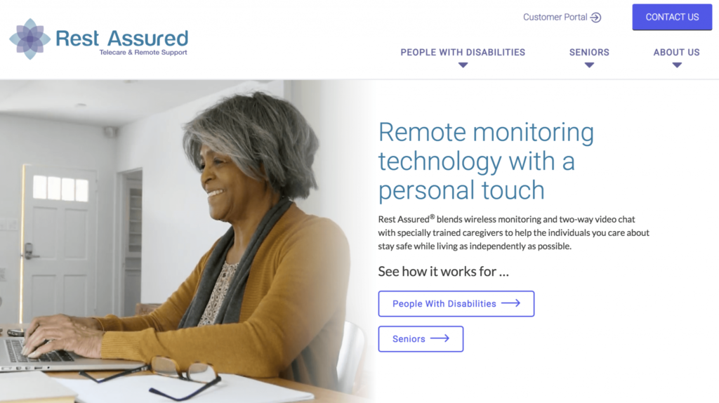
ADA compliance states that all technology must be accessible to people with disabilities. It’s up to marketers and designers to tailor their content and websites so as to meet ADA accessibility standards. Health care websites must comply with ADA regulations because they allow all patients to have equal opportunities to access and understand company material.
To learn more about best practices for improving ADA compliance on your healthcare website, visit our blog.
Next Steps with Pyxl
Interested in more tips on how to improve your healthcare website? Check out our blog on the “8 Components Your Healthcare Website Needs.
Creating an accessible website starts with following the best practices listed above. Pyxl is here to help your company stay accessible and up to standards. As industry experts, we understand and have experience navigating the complexities of digital marketing in healthcare. We’d love to work with you – let us know how we can help!
Updated: Apr 13, 2022
 Bonnie Winter

 Kati Terzinski
 Erin Murray