How to Create Effective Landing Pages for Higher Education
In the inbound marketing world, landing pages are designed to capture a visitor’s contact information via a form, in exchange for access to some type of premium content, subscription, or offer. Once you’ve captured their information and delivered the content or offer, this new contact (or lead) can be put into a lead nurturing email workflow, which will allow you to provide them with additional, relevant content to push them down the funnel and ideally turn them into a customer.
In higher education, you’re looking to capture the information of potential students to nurture them to apply to – and hopefully enroll at – your college or university. In order to do this, you need effective landing pages. Landing pages can be used to promote your premium content, including checklists, videos, and e-books, as well as the opportunity to schedule a campus tour or request more information.
Today, we’ll break down 4 elements of effective college and university landing pages and show you some of our favorite examples.
1. Keep it Short and Sweet
Landing pages aren’t the place to go into every detail about your school or program. It’s best to keep the text minimal and break it up with bullet points or relevant statistics. You should be able to explain why a visitor should fill out the form on the page in about five sentences, so it’s important to make those sentences count. Make sure your copy convinces the visitor that they need to request more information about your school or that they can’t live without your eBook on financial aid.
2. Looks Matter
In order to truly have a successful landing page, it needs to be beautifully designed. You don’t want to turn off potential students because your landing page just flat out looks bad. Think about what visuals will draw in your potential students, like images of current students at your college or university, along with small icons or graphics to help break up your text. And of course, your landing pages should be consistent with your school’s branding and colors.
3. Don’t Forget Mobile Users
It should go without saying, but we’re going to say it anyway. Just like your website, your landing pages should be responsive so they can be viewed on a smartphone or tablet while still looking good and functioning correctly. Fifty-six percent of Internet users will use their smartphones for online research when a desktop or laptop isn’t readily available, so don’t lose valuable conversions with a non-responsive landing page.
4. Consider a Multi-Step Form
Are you hoping to increase your conversion rate? Consider using a multi-step form. Multi-step forms will allow you to ask more questions and gather more information without overwhelming your visitors – this is especially important to take into consideration when dealing with high school students who are likely already overwhelmed with the college admissions process. These types of forms also allow you to space out the questions without making it look like a lot of work to fill out. These prequalifying questions within each step of the form will help you gather more information about your potential students, enabling you to give them a more personalized experience.
Now that we’ve gone through what makes a landing page effective, let’s check out some colleges and universities that hit the mark.
National University
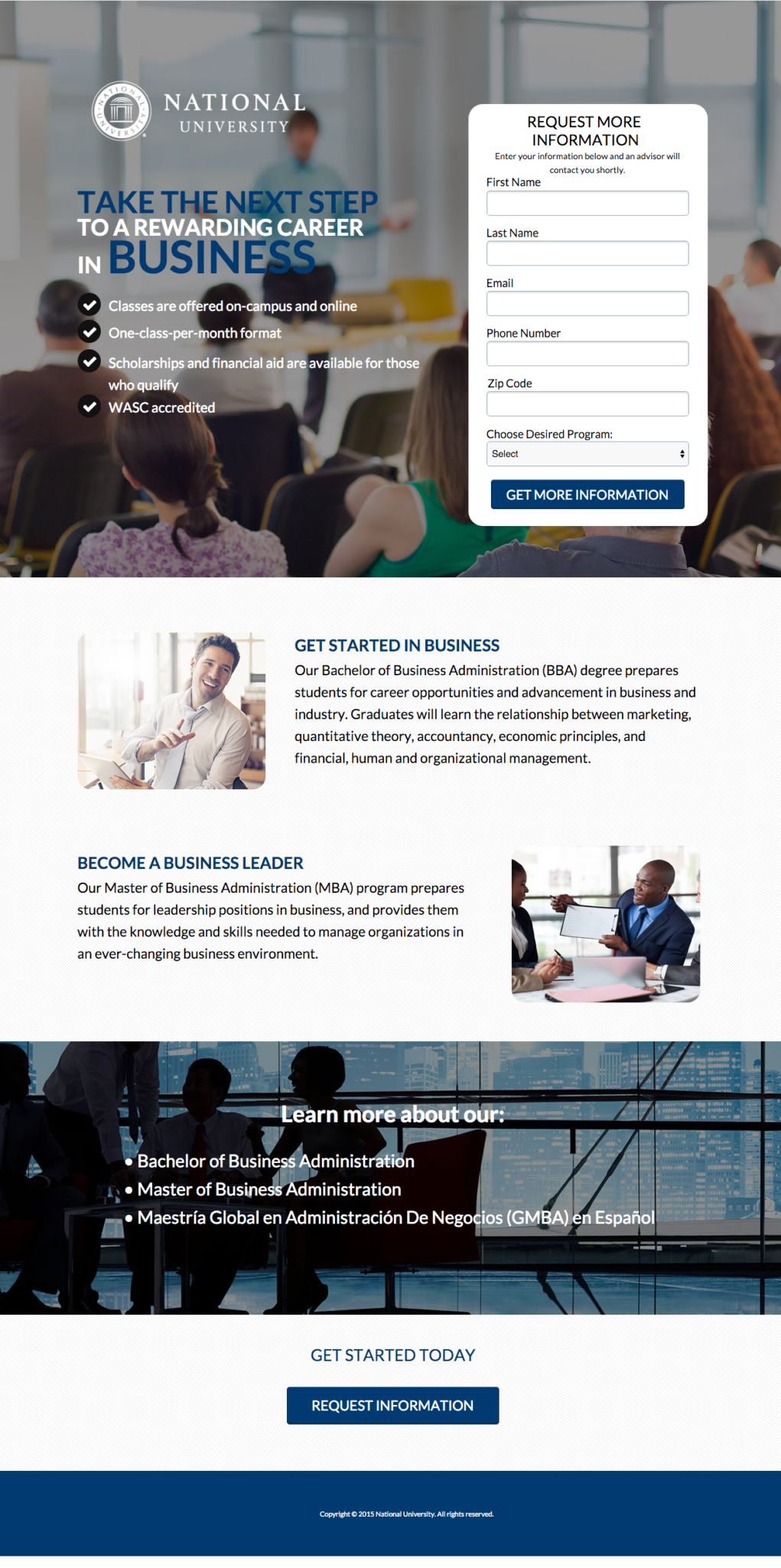
We love how National University’s business landing page uses images featuring students and professionals. This encourages users to visualize themselves both in a learning environment and in a professional environment. The call to action (CTA) at the bottom brings the visitor back up to the form when clicked, which helps ensure they won’t get distracted and navigate away before filling it out.

University of Florida
While our office is based in Tennessee, here at Pyxl we’re big fans of the University of Florida’s Master’s in Social Media landing page, complete with the adorable cat reading on an iPad. The design is modern and simple, while the branding is consistent with the rest of the site. The copy is short and to the point, so the user knows exactly what information they will receive upon submitting the form.

If you feel your Higher Education marketing isn’t reaching its full potential or if you need help creating a marketing strategy for your business, we can help. At Pyxl, we create engaging digital experiences including landing pages for companies across the higher education industry. Let us help you capture your audience while maintaining compliance with a comprehensive digital marketing strategy. Want to learn more about creating effective landing pages for your college or university? CONTACT US!
Updated: Apr 13, 2022

 Kati Terzinski
 Erin Murray