4 Key Components of a College or University Website
Your website is oftentimes your institution’s first impression with a prospective student or parent. It is imperative that your website makes a great first impression and interests them enough to further research – or better yet, visit your school.
At Pyxl, there are many factors we look at when building a website. Still, today we’re going to focus on four key components of a college or university website from an inbound marketing perspective.
1. Call-to-Action
One of the first things to consider when optimizing your website is to make sure you have well-placed CTAs. CTAs (or call-to-action) are used to make things as easy as you can for website visitors, whether that’s prospective students, current students, parents, or faculty members.
A CTA is a callout, usually in button form, which draws the visitor to take any action with you. Some examples include ‘apply now,’ ‘visit us,’ ‘pay the deposit,’ and ‘download the checklist. When trying to decide what to put where; place the most important calls-to-action on the homepage, and include ‘apply now’ at the top of every page, visitors never have to dig to find it. It’s easy and calls out to them, reminding them to apply. The key here is to make it as simple as possible for prospective students to take any action with your institution based on the CTAs you provide.

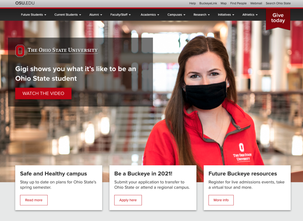
Ohio State University is an excellent example of well-placed CTAs. On the homepage, the two biggest call to action are at the far right of the screen and seem to be the two most important actions. Students can click on their sites – ‘Apply Now’ and ‘Visit Trinity’. There are additional CTAs at the top of the website that is always visible to the site visitor.
2. Website Layout & Design
The second key aspect of your website’s first impression is its layout and design. Are you using big, high-resolution imagery of current students and fun activities at your university? Is your site design appealing and helpful to your target audience? With the rat race against thousands of other colleges and universities, you are fighting to bring people to your site and keep them there. Making your site is visually appealing will help you attract and potentially convert prospective students.

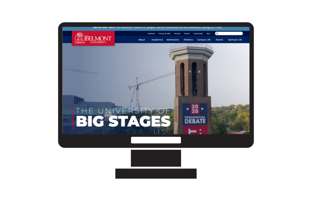
Belmont University’s website layout is different from many others, but the key here is the interesting use of visuals. The beautiful academic center building on campus is taking over the page, drawing the visitor in. The bottom correct box scrolls through student imagery as well.
3. Navigation
An easily navigable website with quick, relevant information is the third component to consider for your institution’s website. The user experience plays into the importance of that first impression, and it needs to be an important factor. Start with the homepage – is it naturally easy to find what you need as a prospective student, current student, parent, or faculty member?

Cornell Tech does an excellent job of segmenting their different audiences at the top of the home page, directing them to content and information that applies to them. In addition to that, there is a second navigation bar where visitors can navigate directly where they need to go, whether that’s academics or quick facts about the university. Providing direction to help visitors know where they need to go should be an initial thought, not an afterthought.
4. Responsive
The final key component to a college website is that it should be responsive. In today’s world, it is necessary to have a responsive website that works well and looks good on mobile devices or tablets.
In the last six years, the average bounce rate for higher ed websites has risen from 47% in 2014 to 57.44% in 2019. This is another area where increased mobile use may be the most likely explanation. Mobile users generally have higher bounce rates, particularly when the page isn’t optimized for mobile devices. Even Google recognizes this importance and is now penalizing websites that aren’t optimized for mobile.
Leave an indelible mark on your institution’s target audiences using your website. Incorporate these four key components, and you will have happy visitors who want to come back for more. Interested in learning more about attracting your ideal student base? Download our e-book!
Let us help your college or university achieve website success! CONTACT US!
Updated: Apr 13, 2023
 Bonnie Winter
 Kati Terzinski
 Erin Murray