10 eCommerce Website Features You Can’t Afford to Skip
You’ve put a lot of time and effort into building your eCommerce website, and the launch day is rapidly approaching. After checking your checklist, you believe that everything is in order. A memorable and attractive domain name? Check. An appealing logo? Check. Products uploaded, images added, prices updated? Check.
Entrepreneurial spirit and elbow grease? Check. And just like Jake and Elwood, you’re ready for the big show. Right?
Wrong.
The digital landscape changes rapidly, and much of the information about setting up successful eCommerce sites are quickly outdated. In fact, within a couple of years, this blog post will also be outdated. Nonetheless, it’s up to date now, and you’ll be able to break into the market with that.
Getting site visitors and increasing conversions isn’t about merely having attractive images and properly placed keywords. Here are ten things that you should take the time to get right with your eCommerce site before you can expect any kind of return on your blood, sweat, and seed money.
1. Top-Notch Security
If you’re going to allow customers to make purchases on your site that sells things, you’re going to want some level of PCI compliance, which is a set of rules and requirements that credit card companies have agreed upon for secure site transactions. Among other things, this means delivering a portion of your website over HTTPS protocol.

In the past, it was common practice for a website’s product information to be displayed on a non-secure domain and the product transactions to be conducted on a secure domain. While this format has some moderate advantages, using a site-wide secure protocol has two primary advantages. First, you won’t need to decide when and where a page needs to be served securely (which may change over time), and secondly, it creates a more substantial level of confidence in the user if they know that their entire shopping experience is secure.
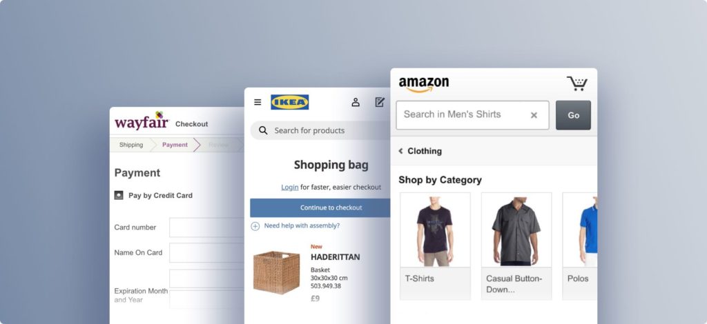
2. Start Responsive
With the recent changes in Google’s algorithm, quickly followed by updates from Bing (which is still a thing, apparently), sites optimized for mobile devices will receive a higher ranking in search results than sites without. With dramatic increases in mobile browsing (both in the US and internationally), mobile site design cannot be seen as an afterthought in your eCommerce design process. Asking your designer to “just make everything skinnier” will only end in tears — for the designer, for the customer, and, when you finally find your site on page 17 of Google’s search results, yourself.
3. Build a Map, Not a Labyrinth
If you only sell one product, you can get away with a giant image on your homepage and some attractive models showing the product off, with a bright button that says “Get me!” However, if you’re planning on adding to your product selection, you’ll need a logical layout of how the customer will access those products.
The fancy marketing word for this is “information architecture,” but it just means creating a map to everything you provide on your eCommerce site. It is common for a growing business to “add a new page here” and “include it in the menu.” However, this leads to lost pages and bloated menus. Take the time to add new products to rethink how they will be accessed across the site and concerning one another. Verify that someone who is only vaguely familiar with the product can find it using your site’s search tool (which we’ll assume you do have, suitable?).
4. User-Friendly Design
This leads to another critical navigational talking point. Incorporating iconography into your site navigation can be helpful to create a clean, sexy interface. However, your customers can also find this frustrating since they may not recognize the images or what they mean. Incorporating text navigation into your website helps expand your customer base to international, multi-generational, and handicap-accessible markets.

5. High-Quality Photos
The best advice for getting high-quality photos onto your website is to hire a professional photographer. A photographer can take high-quality photos for your business that look beautiful with your website design and appeal to your visitors. Technical considerations for images are crucial. Images that don’t load or take too long to load will see a consumer drop-off rate of 39%, according to Adobe.
6. Advanced Payment Options
In the world of Apple Pay and PayPal, advanced payment options are a must-have feature for an eCommerce site. Just consider the ease of use associated with Amazon’s one-click shopping. Shoppers with registered accounts can literally buy with the click of a button. There are many popular online payment options.
The key is understanding who the buyer is and implementing the most effective solutions. If your website is limiting payment options, make sure to explain why. If buyers are technology-savvy individuals who tend toward this payment method, it’s important to be transparent as to why it isn’t an option. This transparency establishes that the brand understands its buyers and builds trust.
7. Optimize Load Times, Not Keywords
While it is certainly important to include the correct phrases and headings on your website, it is equally as crucial that your site be optimized to load quickly and cleanly. This affects your customers’ experience, as well as the site’s ranking in organic search results. Having “retina-ready” images and dynamic Javascript functionality won’t serve your customers well if they create such a sluggish experience that causes customers to abandon their shopping within the first few minutes (maybe seconds!) of their visit.
8. Shoot Straight with Shipping and Fees
By this point, you should be able to see two patterns emerging in the features needed (and often overlooked) for a successful eCommerce site. The first is relatively obvious: you need the favorable gaze of the unavoidable Google search. The second, however, has very little to do with the actual software or technology of your site.
You need to win — and keep — each customer’s trust. Even seasoned online shoppers can still be skittish when they’re not making purchases on a mega-market website (I’m looking at you, Amazon!). One more way to earn their trust is to avoid hiding information in fine print or presenting extra fees at the last minute. Let the customer know upfront what they can expect to pay, and include clear links to your privacy and return policies to minimize any surprises.
9. Include Reviews
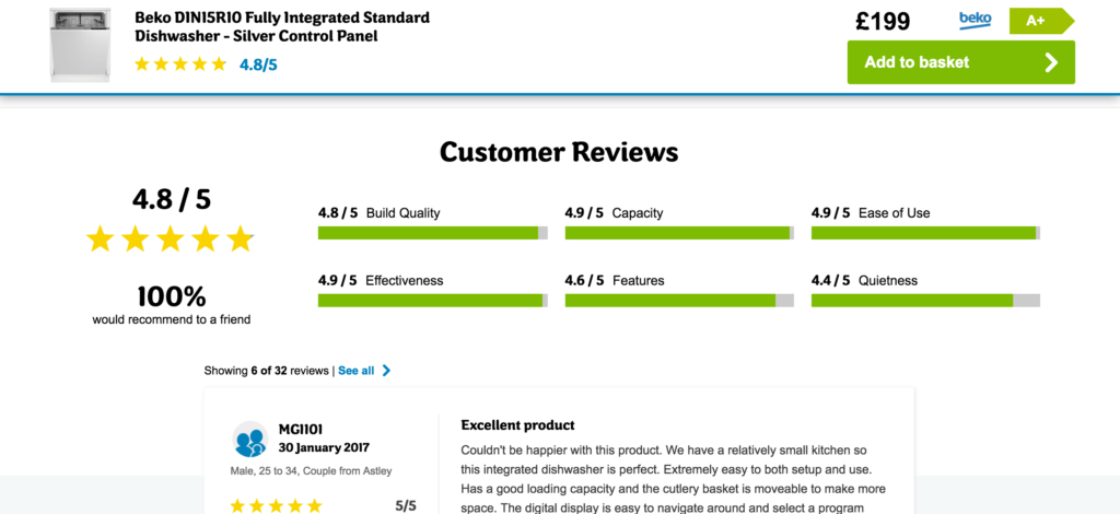
One way to compete with larger, more familiar eCommerce markets is to engage with the customer. This comes down to two primary areas: reviews and feedback. Product reviews, as previously mentioned, hit that sweet spot of increasing search rankings and building customer trust. If a product has been reviewed and has garnered a lot of interest, more people are likely to buy it.

Not only can you provide reviews directly on a product page, but you can also utilize content marketing to create a product culture that customers find attractive. Feedback, specifically about your site, creates an avenue for customers to have a voice. Suggestions for site improvements and questions about products or policies should receive a timely response to let customers know that someone is actively reading and reviewing their feedback.
10. Mobile-Friendly
Mobile shopping accounts for 50% of online transactions. A mobile-friendly website is one that is easy to use on a mobile phone. With a responsive website, content intuitively adapts to whatever device is accessing it to provide the most user-friendly experience. If your e-commerce store isn’t easy to use on mobile phones, it’s time to change it now!
Are you interested in learning more? Is your eCommerce company looking to design and develop a new website? We’d love to talk to you! CONTACT US and let us know how we can help.
Updated: Aug 31, 2023
 Bonnie Winter

 Kati Terzinski
 Erin Murray