The Good and the Bad of Today’s Trends in Website Design
 Bonnie Horner
Bonnie Horner
Bonnie HornerThere are more than 1.1 billion websites on the internet. That’s nearly one website for every seven people on the planet and 4.2 billion of those people don’t have regular access to the internet! Clearly, the world wide web has come a long way in the last 25 years, and a recent and notable advancement is in the design of websites. (If you’re doing it right,) long gone are the days of Comic Sans, Flash splash pages, frames and bevel and embossing. New trends, influenced by these ideas, have taken their place. Skip ahead if you want to see what we think the top five are, but stay right here if you first want to hear what we have to say about these trends in website design.
Build-your-own-website services like Squarespace, as well as frameworks, have helped create a more pleasant website development and browsing experience. Today’s sites are responsive. They focus more on content. And if you’re paying attention, you’ll notice that most share similar structures—helping developers streamline the process of creating the framework for individual sites and providing visitors with a predictable user experience.
But it’s because of these new programs and capabilities, and the consistency they create, that we have to ask, “Has web design become boring?”
What’s Good About Consistency?
Consumers know where to find content. As a marketer, I want to boost my Time On Page stats. But as a consumer, it’s nice to know that I can immediately navigate to a company’s “About Us” page for a bio or that I can quickly scroll to the footer for a physical address. I love the ingrained habit of clicking on a rectangular box to visit another page or initiate a download. It’s even second-nature for most of us to click on the plus sign or hamburger menu to expand content. We should want to increase our stats the right way – by engaging and not frustrating users.
It works. Do we really have to say that there is no need reinvent the wheel? Our overworked developers (we love you guys!) are much more efficient by being able to reuse code. Content blocks and other modules keep pages clean and responsive so your site looks good, regardless of a user’s screen size. There is a reason why airplanes still have wings—they work.
It’s easy to update. Even though our society is getting more tech savvy (except for sweet Southern Grandparents, most people aren’t comfortable with CSS and HTML. WordPress and other user-friendly CMS programs have provided a platform for marketing managers and small business owners to easily update their own web content. Deleting pages, adding modules and changing photos no longer takes an experienced developer.
What’s Bad About Consistency?
It’s boring. How many sites have you visited that feature a top navigation with dropdown options? What about the big hero image with text overlay? Maybe a red call-to-action? Oh, don’t forget the grid of images and preview text, followed by a footer with reverse text and some social media icons.
We aren’t saying this is wrong. Minimalistic design allows content to stand front and center to deliver a message to an audience that is already over-distracted. And we certainly don’t advocate making drastic changes to crucial elements like navigation or logo location. We just think more people need to find creative ways to maintain intuition—and ultimately convert leads to customers—while keeping things fresh.
Now, It’s Time to Bring It
Make the most of this debate between boring and beneficial and make a site your own, while still playing by the rules of creating an exceptional user experience. Remember that list of trends in website design we promised? We’re finally delivering so you can use them on your quest…
Top 5 Trends in Web Design
- Material Design. For the most part, the web has been a free-for-all, hodgepodge of inconsistent styling. Google took a stand and created an in-depth design language known as Material Design. The goal of Material Design is to create unity across various sets of products. Material Design doesn’t just create order, it creates order with purpose and meaning. With Google helping pave the way, many others have followed suit, resulting in a smoother, more consistent user experience. For more on Material Design, see what WIRED has to say on the topic.
- SVG Animation. Iconography has been around since man could paint on walls. And for many years, website icons looked like they belonged in the stone age. With web browsers now supporting more advanced file formats, you will notice the standard icon has gotten a bit of a face lift. With SVGs you can now add animations that would have been reserved only for flash, video, or gif files. SVGs have an added benefit of saving out at a much smaller file size, allowing pages to load faster. Another benefit? SVG icons can scale as large or small as you need them to without losing any quality. Learn More.
- Bright Colors. Like the colors of the seasons, web design color trends also come and go with the wind. Remember when Facebook hit it’s peak in popularity, and it seemed like you saw that “Facebook blue” everywhere? Designers take advantage of using bold, bright colors to make a statement and give web pages more character and life. We are now starting to see color combinations that would have never been approved in previous web design days. Instagram is a perfect example of this with the launch of their bold, bright rebrand earlier this year.
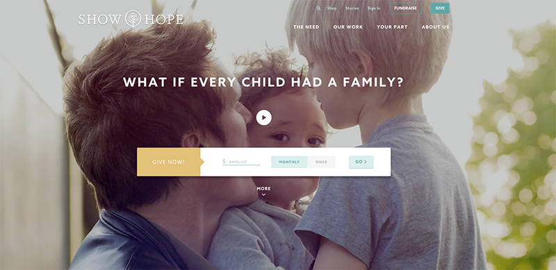
- Custom Photography. We’ve recently seen a rise in the full-screen “hero” image at the top of web pages. Large photography is great, but it is getting way too easy to spot that generic stock photo you’ve seen on a dozen other sites. Investing time and resources in custom photography can push a site from looking good to great! There’s no better alternative than having full control of getting exactly the right shot to fit your needs. (If you don’t mind us bragging a bit, check out the recently launched Show Hope site for examples of excellent custom images and videos).
- Large Type. Typography is another element that is often overlooked, but when done well, can really take your site to the next level. Over the past couple years there has been a dramatic increase in available web safe fonts, making it easier for designers to branch out from the same handful. In a way, your typography is the voice of your site and it can help your brand be heard over the loud crazy internet. Large type is a great way capture engagement and clearly display your message.
At Pyxl, our bread and butter is creating custom websites and web applications. We would love to work with you to implement these new trends in an exciting way to help you better connect with customers. Let us know how we can help!
Updated: Apr 13, 2022